August 12, 2025
When visitors land on your website, the last thing you want is for them to feel lost. Confused users don’t convert, so keeping your navigation clean and intuitive is one of the easiest ways to improve user experience and performance.
When visitors land on your website, you have only a few seconds to help them feel at ease and guide them to what they’re looking for. If your navigation is cluttered, confusing, or overly clever, chances are they’ll bounce. Clean, simple navigation isn’t just good design, it’s good business.
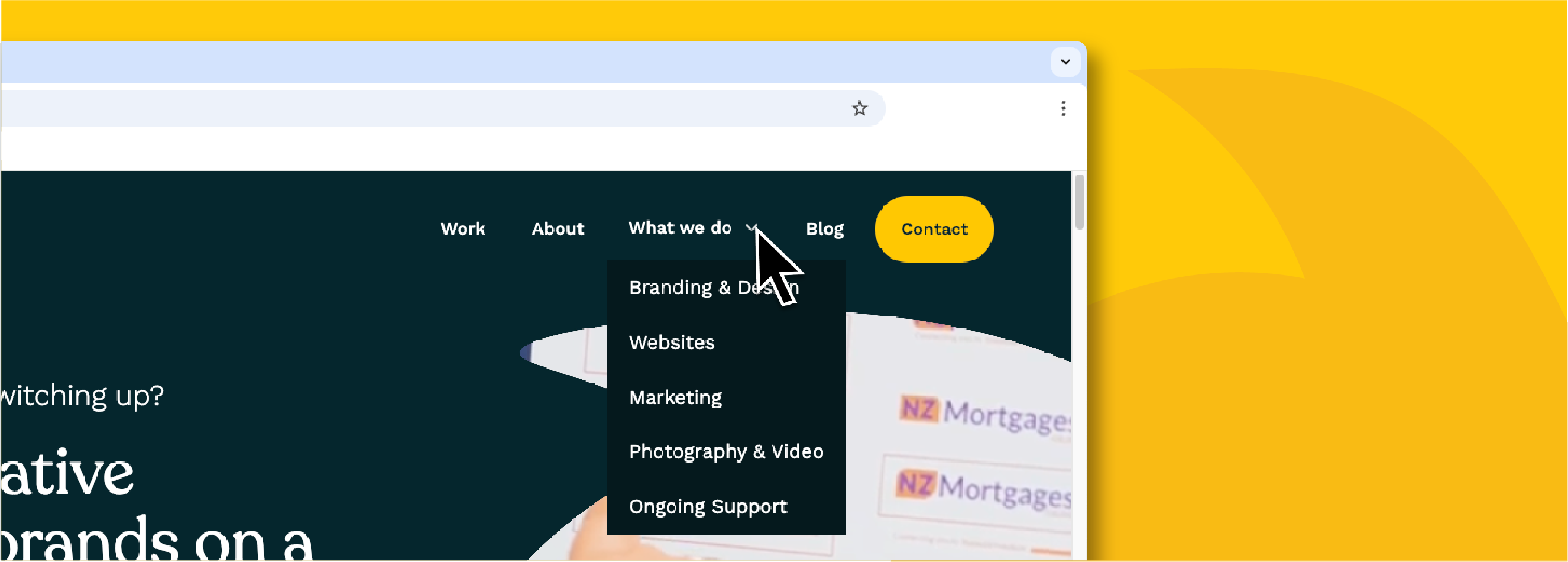
A well-structured menu starts with restraint. As tempting as it is to list everything, sticking to just five to seven top-level items helps users process their choices quickly. Think of it like walking into a well-organised shop: you want to know where to go, not wander around looking lost. Keep the top-level navigation limited to your most essential pages, and tuck the rest into well-labelled dropdowns where needed.
The language you use in your navigation is just as important. Clear, familiar labels like "About," "Work," "Services," or "Contact" perform better than quirky or vague alternatives. A button that says "Let's Chat" might seem fun, but "Contact" is immediately understood and more likely to get clicked. Users shouldn’t have to guess where a link will take them.


